They say the devil is in the detail, so let's talk about the small but significant ones for your advertising campaign the details - the bugs - that can make a banner ineffective.
Failure to respect the visual identity of the brand
Usually banner leads to your business page, where you hope and want the customer to take the action you want them to take - buying a product, ordering a service or getting to know your brand better.
It is therefore important that the banner reflect what a clicker will find on your website - which means that it must be consistent with the brand's visual identity, without being radically opposed to it and unrecognisably different.
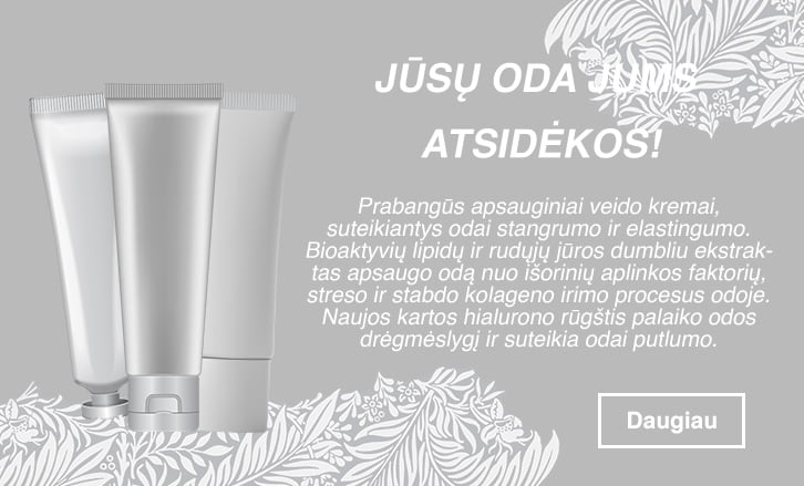
A banner is a riot of detail, colour and/or text, aka a "brothel"
The holy prayer of every good banner: the simpler the visual + the clearer and simpler the text = success. Because viewers are only likely to glance at your banner for a fraction of a second, and that's the amount of time you can give them to take an interest in you. Use that time well - Don't overload your banner with visual and textual chaos.

Subtle - sometimes "invisible"
Following on from the above point, subtle and clean banner design must not go to the other extreme and become invisible, disappearing. Your banner designers need to find creative ways, how to catch the viewer to catch the eye and stimulate interest, or maybe even encourage you to click and find out more.

Poor and primitive visuals
Nothing is worse than poor, unaesthetic photos, crude and "cheap" animation in banners.
Can't afford a professional photographer and models?
Then get the right photo from the huge stock archives. Finally, a brilliantly written and catchy text can turn into a great banner in the hands of a good designer using not only colours and distinctive fonts, but also movement that draws the user's attention.

Incorrect colours for the main message
There's not much to add here: colours must be chosen appropriately - not only according to your brand's brandbook, but also according to the message you want to send to your audience.
Colour is the first thing that registers when people see a banner. And each of them has different associations, so it's very important to know what emotion you want to evoke in your audience - and to choose your colours and colour accents accordingly. Read more about the meanings and moods encoded by colour here.
High "weight" advertisements
The size of the banner should be as small as possible - Ideally, it should be less than 150 kb. Smaller ads like this will load faster, which means the user won't be able to scroll down the page without seeing your banner that hasn't loaded.
Improperly used buttons
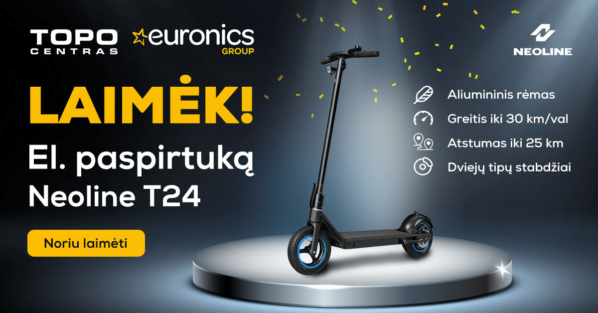
If you want your banner to encourage people to click to find out more, you will usually need "action button". Studies show that they do indeed help increase click-through rates. But out-of-place buttons make things much more complicated and reduce clicks.
Buttons are best used after text, right or left bottom of the banner, making them tastefully colour-coded and keeping the same button design across different banners in the same series.

Text that is difficult to read
This usually happens when there is too much text, or when designers are tempted to use very fancy and eye-catching text. No, a person visiting the portal to read the news won't be scratching their head and guessing what you meant to say in that fancy font - they just won't notice your banner because it's just another intrusive coloured background.
Not recommended use italics, very small or very small font (unless it is a mandatory note with a * or similar).
